

Through in-depth user research and testing, I identified key pain points that shaped high-impact design decisions—improving accessibility, navigation, and overall usability for Austin History Center’s diverse user base.
80% of users relied on the new table of contents to quickly locate target information without needing assistance.
Conducted in-depth user research to uncover key pain points, directly shaping design decisions.
Simplified content and structure led to increased task success and reduced user frustration.
Applied USWDS accessibility guidelines for compliance and inclusive design.
While staff could guide users effectively in person, the website presented dense, overwhelming content that confused new visitors. Users struggled to find basic information without contacting the center directly.
Initially, I conducted a competitive analysis of the DC History Center to better understand their strengths and weaknesses, and gain insight into how archives are being stored digitally.
This informed my approach to the Austin History Center redesign. By analyzing what the DC History Center did well—such as straightforward navigation, engaging content, and accessibility features—I was able to pinpoint strategies worth adopting. At the same time, I noted areas where their site fell short, like confusing search functionality or lack of mobile navigation optimization. I flagged these as potential pitfalls to avoid. With this in mind, I needed to better understand how current users were interacting with the website—and what better way than conducting user interviews?
The Austin History Center (AHC) did not initially have a specific audience in mind, as its users varied widely. Early conversations revealed the challenge of narrowing down a target group, eventually suggesting a broad scope.

I led the effort to conduct user interviews, despite initial challenges with limited participants and scheduling conflicts. I proactively reached out to clients and utilized tools like Calendly to streamline scheduling. As a result, I successfully conducted 7 out of 9 interviews, focusing on gaining a deep understanding of user needs.


.png)
By utilizing an affinity diagram, I facilitated the process by encouraging each team member to watch the recorded interviews and review the transcripts I had uploaded. Once all insights and observations were listed, we grouped them into themes and considered business goals to prioritize those that were most feasible and valuable within the given timeline. This approach not only deepened our understanding of user feedback but also fostered collaboration, ensuring everyone was aligned and on the same page.
After collecting the data, I led a collaborative effort within the team to synthesize their feelings and find recurring themes.
This process helped us identify recurring themes and user pain points, directly shaping our design decisions. Keeping business goals in mind, I emphasized the importance of balancing user needs with business requirements—validating these challenges through our user interviews. Now there were about seven recurring themes, I can’t possibly see the advantage of trying to solve all of them at once, therefore I suggested to have a clear scope of work that allows us to design what is feasible and valuable therefore we focused on the following insights:

Our research aimed not only to understand AHC’s diverse users but also to explore how we could create a positive impact on the community. By identifying user needs, pain points, and behaviors, we sought to make AHC’s historical content more accessible and inclusive for all users — especially those exploring archives for the first time.
How might we optimize and simplify the content organization to enable users to quickly find the information they need?

“I think there's a lot of information that's being presented to the user through the website. And it's very verbose because you have, there's a lot of information that needs to be presented. “
-Maria-Elena, Reference Librarian
“There's not a search and if you do a control F on the site, it doesn't find anything that's in the collapsible parts”
- Tina, Librarian Supervisor
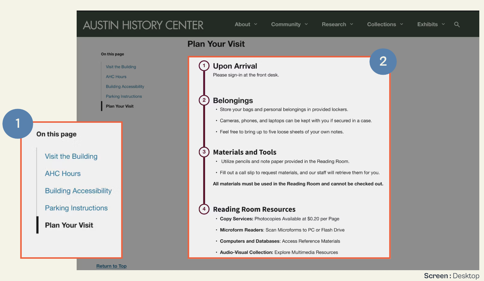
My research and initial sketches laid the foundation for the final design. To enhance discoverability, anchor links were implemented, allowing users to navigate seamlessly. Additionally, I structured the content with a clear visual hierarchy, improving readability and addressing both user navigation challenges and the client's content organization goals.
Usability testing revealed that 80% of users utilized the anchor links, and all participants successfully found the information without assistance, demonstrating the effectiveness of these improvements.

“And I do love the black bar with research collections, reproductions, and outreach exhibits. But I think the main webpage could do a little more to show that off, especially for new users.”
-Katie, Library Staff
“And I think it's fairly user-friendly, in figuring out where things were. I think the landing page is kind of boring, I guess.”
- Christina, Reference Librarian
Based on initial user interviews, we refined the homepage layout to provide users with quick access to the most relevant information and resources used. The updated design includes dedicated sections for:


“I know I need to ask a question, I just don’t know where to go online.”
-Natalie, Higher Education Scholarship Coordinator
“A divide between what kinds of research and reference services they can provide for free on demand and what kinds they actually charge for”
-Tina, Librarian Supervisor
To address users' lack of awareness about contact services and their difficulty in seeking assistance, we took proactive steps to improve visibility and accessibility.

I conducted usability testing on the new designs to measure success metrics. The challenge arose when we ran two separate tests, each with different goals: one focused on navigation and content, and the other on visual appeal and readability.
The Struggle: This approach made it difficult to track progress over time, as we were measuring different aspects of the user experience. The lack of alignment between the two tests complicated our ability to analyze and compare the results effectively.
The Solution: Due to time constraints, additional rounds of testing weren’t feasible. However, a key takeaway was that design is an iterative process—even without immediate refinements, future iterations remain possible. Recognizing this allowed us to focus on high-impact from each test conducted and make improvements based on recurring pain points present.
This approach helped identify recurring pain points, behaviors, and opportunities for improvement. By categorizing observations with a color-coded system, we could pinpoint the most critical usability issues and prioritize them for iteration.
Accessibility goes beyond color contrast—it's about the whole user experience. It means designing for everyone, including those with visual, hearing, motor, or cognitive challenges. That includes keyboard navigation, screen reader support, alt text, video captions, and clear, simple language.
UX often comes with ambiguity—in both the work and team dynamics. This taught me to step up when needed, support others, and create a collaborative environment. When expectations around tasks or deadlines were unclear, I learned to define roles and clarify what “done” really means. These moments reinforced the value of clear communication and alignment. A supportive team makes all the difference, and I’m proud that my peers appreciated my collaborative approach.
I quickly learned that design isn’t one-size-fits-all. Sticking to a rigid process had us repeating work and wasting time. Once we embraced flexibility, used existing insights, and followed a more agile approach, we moved faster and focused on what mattered most. This experience showed me that adapting the process to fit each project is key to working smarter and delivering better results.4o
Balancing user needs with client goals was a key challenge. I learned the value of clarifying business objectives early and asking the right questions to align them with user pain points. When the scope grew too ambitious, I recognized the importance of setting boundaries and clearly communicating what was out of scope. Going forward, I’ll focus on realistic goal-setting and open communication to keep projects aligned.
Things don’t always go as planned, and that’s okay. The key is to address issues as they arise, communicate effectively, and adapt with a positive mindset.
“Don’t borrow from tomorrow’s problems.”
― Jennifer L. Armentrout
Not all problems can be solved at once, and design is an ongoing process of iteration and improvement. While we addressed key usability challenges, there are still opportunities to enhance the experience further. Our next steps include:
Improve organization and accessibility to help users find staff members more easily.
Streamline contact forms to reduce confusion, ensuring users can quickly identify the correct form for their needs.
Expand accessibility by providing key content in Spanish to better serve a diverse user base.
Continue testing to validate improvements, ensuring that labeling, navigation, and interactions align with accessibility guidelines for all users.